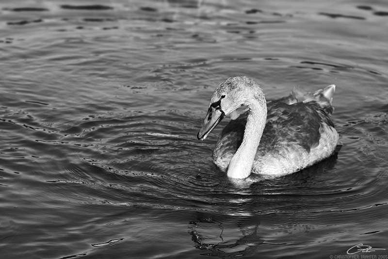
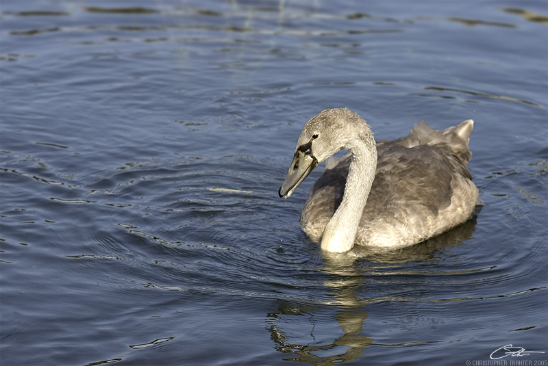
I really like the b&w more. Not really sure it just sticks out a lot more then the color one.
What did you use to convert it?
"Let us declare nature to be legitimate. All plants should be declared legal, and all animals for that matter. The notion of illegal plants and animals is obnoxious and ridiculous."- T. McKenna
Yeah I am digging the signature too, I need to come up with something to put on mine.
"Let us declare nature to be legitimate. All plants should be declared legal, and all animals for that matter. The notion of illegal plants and animals is obnoxious and ridiculous."- T. McKenna
But just going to the hue/saturation is easier so I can just desaturate and then play with the brightness.
thanks.
anyone use curves?
"Let us declare nature to be legitimate. All plants should be declared legal, and all animals for that matter. The notion of illegal plants and animals is obnoxious and ridiculous."- T. McKenna
I think there are ways of doing it with the digfferent colour channels or something but I wasnt sure. I must admit i just use levels, curves looks to complicated
I love how the swan/goose stands out on the BW. But the blue-ish/grey water goes great with his feathers. So I guess Im not much help cause I like them both.
great photo i love the ripples/ reflections in the water. and the texture of the feathers. very cool. and yeah i like both versions, but do agree that the b&w is more .....striking.
I think there are ways of doing it with the digfferent colour channels or something but I wasnt sure. I must admit i just use levels, curves looks to complicated
thats what I use (channels) - by removing the channels to leave just one (say the red channel) gives a totally different feel to the greyscale image than say if you left just the green channel.
here is a pic i put together as an e.g.
the top pic is just the red channel, the blacks are clearly deeper in this format. The other two have come out looking similar to each other - but you can see that the blue channel looks a little more washed out and the highlights on the tyre wall text have come out a touch lighter.
depending on the image depends on which channel is best to pick - I think this is a better starting point than just say "de-saturating" as the result of this can often look a little flat.
.....just my humble opinion....
by the way - I love the water on the black and white one ctranter, it almost looks as though its been "burnt in" a bit more than the colour version. Im a big fan of b&w photography.
Last edited by adamcrohill; 09-08-2005 at 10:22 AM.
Reason: typo's
1) Duplicate my photo on a layer above it
2) Add a Hue/Saturation adjustment layer above both
3) Play around with blending modes and opacity of that duplicated copy as well as the adjustment layer until I get the results I like
4) When all is well, I'll flatten then use dodge/burn tools to touch up. Often times I'll keep two separate files of this ... one with the layerd file pre-touch up, one flattened and touched up. That way I still have my original picture and if I need to go back and adjust it further I can.
I'm pretty much a non-destructive, layer mongering whore. I've had some photos I've touched up that end up being 10+ layers before I'm satisfied with the final results. Don't do it with every photo, but if it's something I know I'll make a large print of or will include in a print design I'll spend that extra time to get it perfect and give me the option to make adjustments down the road.
there's an easy to use converter for B&W in photoshop. all you need to do is go to the menu and do convert to grayscale. i forget what the menu it is in, however it's one of the ones next to the file menu.
there's an easy to use converter for B&W in photoshop. all you need to do is go to the menu and do convert to grayscale. i forget what the menu it is in, however it's one of the ones next to the file menu.
Image>Mode>Greyscale
"Let us declare nature to be legitimate. All plants should be declared legal, and all animals for that matter. The notion of illegal plants and animals is obnoxious and ridiculous."- T. McKenna


 Reply With Quote


 "Wah wah wah Dorothy Parker wah wah wah" - hanratty21


 i love the ripples/ reflections in the water. and the texture of the feathers. very cool. and yeah i like both versions, but do agree that the b&w is more .....striking.


