|

-
Senior Member

Jujumon I love your blue image.
FlashL!ght what can I say...
YOU are one of my inspirations... my first battle was with you and Mandisected... Your work is outstanding.

Here is my attempt!
-
@ FlashL!ght ....wow...
Thats nice nepzap, the upper half reminds me of Star Trek: Enterprise opening...It looks like at the bottom half you lost your train of though though...It kind of flows together, but it looks like you got distracted or rushed on it.
It's nice overall just looks like you lost your original thought. Btw, everything except that purplish/blue thing leading off to the right, leads the eye very well down your page, going to every element.
It's better than what I could do.  GJ...wow...I got a bit long winded... GJ...wow...I got a bit long winded...
"For an assassin he...he is pretty nice." ~The Darkness that Comes Before
The Catalyst Corp.
-
It seems I have been away for a while with the projects I have going on right now but damn this is the kinda of stuff that gets my Hyped to become better. I came here for inspiration for a banner Im doing for vzw internally and look what I see flash I want that las image too for a desktop. all of the tech images I see are crazy I have a lot of work especially on my vectors.
"What do you call a mouse's Shadow in the second moon?"
-
Flashl!ght I have to ask how is it that you got the cables so smooth in the curve and variation of colors? Also for the vectoring what program did you use to do that?
Last edited by thedarkness; 11-01-2007 at 11:04 PM.
"What do you call a mouse's Shadow in the second moon?"
-
He has risen!

 Originally Posted by >flashl!ght<
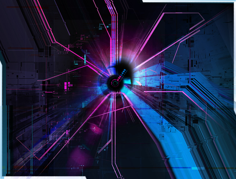
lefteye - it was made using Fireworks, which is a hybrid vector/raster app -- I guess kinda like the core toolset of PS and AI combined. Technique on the swoops meaning the psuedo 3d-ish effect? I created the swoops using the pen tool, usually only 4 points, sometimes 6 points, and it's just a gradient fill. Then I duplicated, moved the dupe below the original, changed the dupe fill to be darker and offset some of the points to reveal them emerging behind the original to create the perspective feel. Really simple, but a convinving enough effect -- same effect used in Vita, my march madness geoconstruct(that was the first time I tried it) and various other images. Then I added some brush strokes over top with various blend modes to make it look a bit less solid and more natural/textured.
-
I guess I need to post something else here too whew tough crowd these days
Last edited by thedarkness; 01-08-2008 at 07:01 AM.
"What do you call a mouse's Shadow in the second moon?"
-
Oh, even though this is a themed battle there's quiet a variety in the images. Good work to both
-
·»¤«·

Inspired by the colors of zap's last image...
>flashl!ght<
All the normal names were taken.
Ron Paul was right.
-
Dude flashl!ght you are sick with the detail.
"What do you call a mouse's Shadow in the second moon?"
-
Mourning Morning.

OK... I sorta lost my way on this one, so I am posting it today (i.e. cutting myself off before MM starts).
I will say that tech style is not my strong suit, but I wanted to challenge myself. Especially after looking at some of flashlight's images.
So with that in mind, give me some feedback.

-
Hey group I like the image. I like how you created a since of depth in the picture. Now as far as the layout it somewhat has my eye just jumping from here to there, I would have like have seen some different colors besides green on green so to speak. On the plant stem the edges are a bit choppy but for this to be your weakness overall a good stab at it. Yeah flashl!ght's work is whew I tend to find myself in awwwww when I look at it. Hope to see another post here from you.
"What do you call a mouse's Shadow in the second moon?"
-
Mourning Morning.
Thanks for the feedback. I was going for the monochromatic look, I will broaden the color pallet next time.
I was trying to make a contrasting point between the "artificial" and organic delivery of life, but I do agree with you on the layout.
I will definitely give it another go soon.
(How soon depends on how I do in March Madness)
-
Planet Claire Embassator

Originally Posted by thedarkness
"What do you call a mouse's Shadow in the second moon?"
Too much drugs on your blood stream 
I'm so fashion, everytime I fart, Prada releases a new fragance!
-
-

i really like it groupof1. and i really like the monochromatic (is that really a word?!) look.
personally, composition-wise, i think it would work better if you cut it off just after the word technorganic (nice word!).
only other criticism is as thedarkness said- some of the vector-looking bits are a little choppy. and the word technorganic would do with being a little ....crisper.
but definitely nice work 
-
Mourning Morning.
Thanks, I was trying to make the text sink into the picture like the vines but may have got carried away with the blur tool. And, looking at it now, I see what you mean about cutting it off after the text.
Oh yeah, yes monochromatic is a word. (technorganic isn't  ) )
What the world needs now is a nice hot bath.
_________________________________________________
Battles: Silverx2
-
Planet Claire Embassator
Originally Posted by groupof1
Thanks, I was trying to make the text sink into the picture like the vines but may have got carried away with the blur tool. And, looking at it now, I see what you mean about cutting it off after the text.
Oh yeah, yes monochromatic is a word. (technorganic isn't )
Maybe u should test with a duplicate layer of the text, render it and then do a motion blur and test with the layer effects (multiply, screen, etc...) or use a gradient effect on the text layer
I'm so fashion, everytime I fart, Prada releases a new fragance!
-
biology nerd

flashlight, i just have to say that your VITA image is AMAZING.
-
I really like the rules. It has provided a lot of scope for creativity which delivers *thumbs up*
-
Planet Claire Embassator
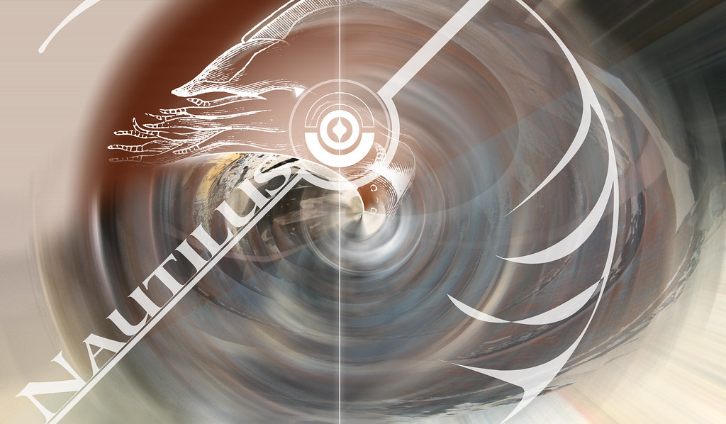
Not has good has some of the other images, but it was one of the images I was doing for MM2008 Round 1, I think it fits a little bit in here ^^
I'm so fashion, everytime I fart, Prada releases a new fragance!
-
All I can say herr is I luv it I luv it. I luv how you use the nautilus shell as a focal point and everything else moves outward. I also like the placement of the lettering.
"What do you call a mouse's Shadow in the second moon?"
 Posting Permissions
- You may not post new threads
- You may not post replies
- You may not post attachments
- You may not edit your posts
-
Forum Rules
|
Click Here to Expand Forum to Full Width

|


 Reply With Quote