|

-
-
The main criticism I have is that they all look a bit bland. Experiment with, say, making the octopus look scary, or use some lighting on the bottom characters to make them look sheepish or frightened. Challenge yourself -- spill some ink on the paper and turn it into a creature, scribble down a collection of random colours and make them into a composition. I don't know, but it seems like you are well within your "comfort zone" at the moment; artistically, you don't want to spend too much time there...
-
Well you have proportions & frames down.
I quite like these, "simplified and cutsie" - Fluffy and fun.
I'd like to see some of your experimental works. Pretty much as golliard said.
-
those sketches have very simplified shapes (round, smooth, easy). And giving critique means for me usually guiding someone into a new or different direction.
So my suggestion would be to experiment with more details and more complex shapes/ situations. The more details you add the more the character speaks to a viewer.
perhaps I´ll post some samples of what I mean later
-
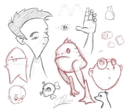
with details I meant something like this:

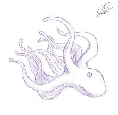
and with the octopus I thought that it would be a good sketch to color and playing with lights

though these are just some rough examples ,- anyway if I had pick 1 point ´d say you could improve the details
 Posting Permissions
- You may not post new threads
- You may not post replies
- You may not post attachments
- You may not edit your posts
-
Forum Rules
|
Click Here to Expand Forum to Full Width

|


 Reply With Quote