|

-
-
say no more

There's a few different things going on there.
But you're on the right track. Simply reducing the saturation probably wont get you this effect though. If you're editing in RAW, you can try desaturating certain colours - so desaturate the blues for a warmer tone or desaturate the reds for cooler. That way you're not actually desaturating the entire image, you're just removing the saturation of certain parts of your image.
Also, for skies, try playing around with the luminance of the blues. Some of those shots are scanned photos so wouldn't really be something done straight in photoshop.
Also try reducing the contrast or bringing the blacks down a little.
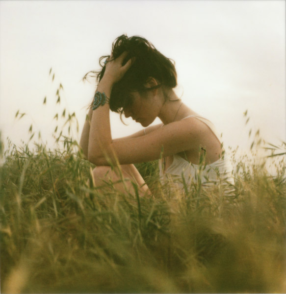
You can also achieve certain looks by changing the white balance and using different colour lights when you shoot. We used a single modelling light (which was orange) and light from a window for this shot:

It's not the same as the images you posted but you can see how it has a cooling colour going on (from the window) while we balanced the light for the orange modelling lamp.
-
-
Senior Member

That's a real good start.
I will have to find the link later but there's a cool way to get color tones where you open your final edit and then find a paining with a color palette you like and then match color the 2 files and see what happens.
"Let us declare nature to be legitimate. All plants should be declared legal, and all animals for that matter. The notion of illegal plants and animals is obnoxious and ridiculous."- T. McKenna
-
Senior Member

try some cross processing effects (google for tutorials) using curves then desaturating?
-
exclusive member ( V I P )

Navis has a post in his blog where he explains this creamy effect:
"I get asked this question asked the most. While it’s a highly guarded secret I will quickly go through some of the process. Depending on the photo, this part takes forever sometimes. Right now I like these earthy, brown tones in my portraits. I’ll start with levels first. This will give me control over the exposure and blacks. Next I do a very weird desaturation to resaturation process. I’ll take away color, add layers of color and resaturate the photo. This is a little process I made up (at least to my knowledge) and it gives me nice, even, coloring through out the photo. I do this process a lot through out the editing process. Et voila, you get pretty." http://blog.navisphotography.com/category/uncategorized
You should also try opening an image, and doing one of the following to learn some tricks:
1. Add adjustmen layer of levels, from drop down menu choose Blue Chanel, change the ends of the gradual bar under the histogram. I clipped about 15points from each end.
2. Add selective color adjustment layer. Go to blacks and change the yellow bar until you get desired blue hue in shadows. Go to white or gray and change the yellow to get desired cream color on highlights. Be careful not to overdo selective color, it can really destroy the natural color separations.
3. Try adding a gradient map adjustment layer. From the gradient selection choose a simple black to white, then change black to blue and white to yellow. Now you have to change the layer type from normal to soft light and reduce opacity to near 15% until you get desired effect.
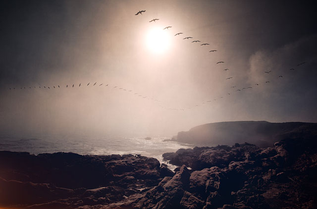
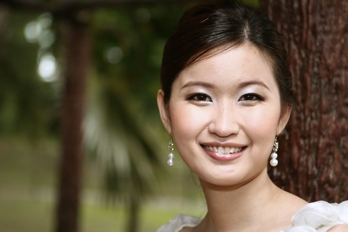
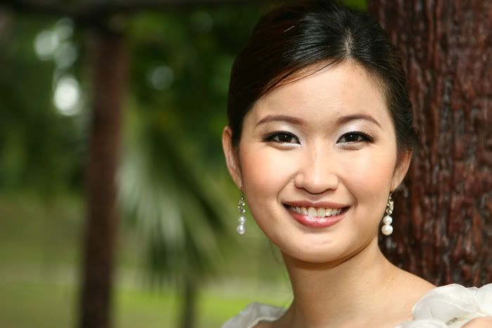
Have fun! here are my samples of what my layers do to an image:


-
I'm sure that you can achieve these kind of effects with the photo editing software PhotoStudio
-
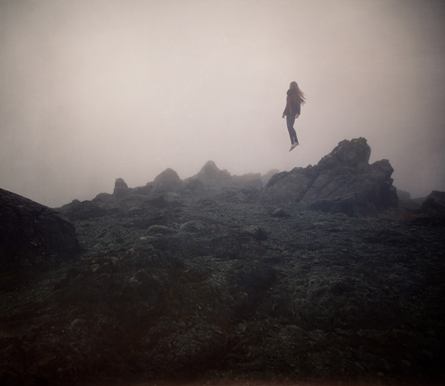
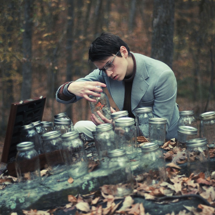
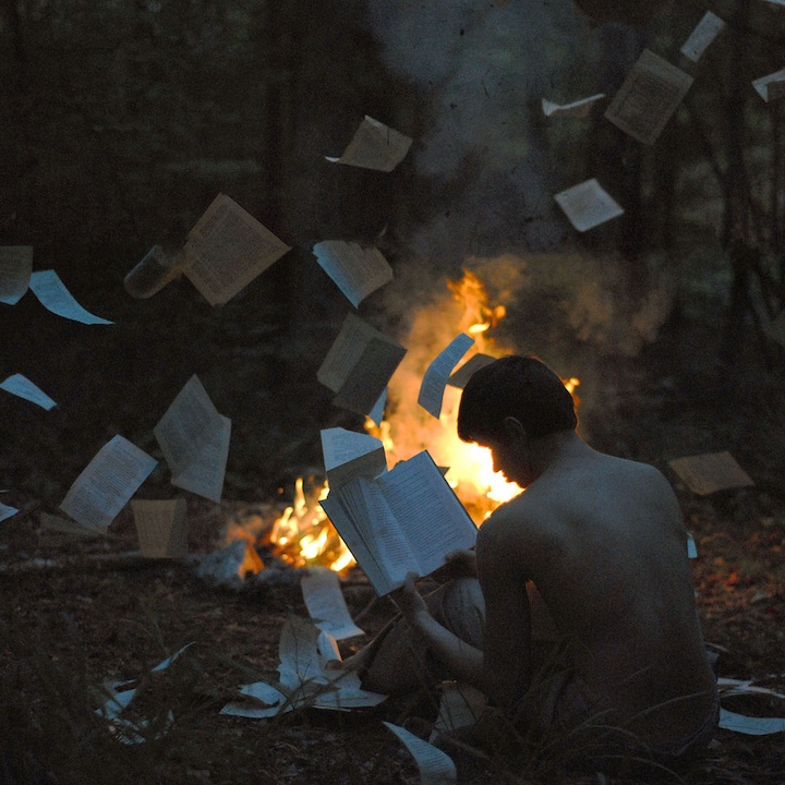
Oh man I love your photos!!! so beautiful!!! and the color effects are amazing!
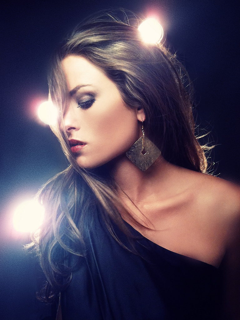
classic and seems a little HDR effects to me.
 Posting Permissions
- You may not post new threads
- You may not post replies
- You may not post attachments
- You may not edit your posts
-
Forum Rules
|
Click Here to Expand Forum to Full Width

|


 Reply With Quote

 =-
=-