|

-
HUH?

Opinions on poster graphic
Just wanted to get some opinions on this. This an image I created for a cruise drawing our company is having. Thoughts . . . Comments...
-
Senior Member

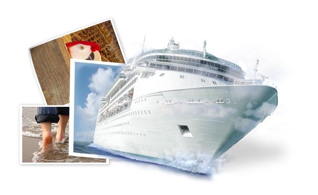
I like the idea behind image of the person walking in the sand the the parrot...a little indication of the kinds of relaxing activities normally associated with being on a cruise ship along with a subtle nod towards pirates, who of course are always fun to be around. 
Technically though, I don't know if there is much actual beach walking done while on a cruise. As I understand it a cruise is more centered around onboard activities along with the possibility of shore leave at various ports of call. So sure, walking on the beach is probably not unheard of depending on where you stop, but you might want to use an image(s) that has a stronger connection to the activities the winner will experience while actually onboard the ship.
This would be especially true if you want to project a more 'exciting' feeling. The image as it stands right now has a rather 'relaxed' feeling about it. It says to me I'm going to get on this ship, breeze to my destination and then idle away the hours walking along the beach. Along the way I might even run into an exotic parrot or two. Sounds neat! It doesn't however, generate a lot of pure excitement.
I'll say right now that what you have is not bad, I'm just giving you my perception of the image and throwing out some suggestions.
As for the cruise ship itself, I really like the concept in general of having the ship coming out of the picture. A couple of things that I think might improve it though, are if you were to straighten out the ship and picture so the water line is level and instead rotate the image with the feet on the beach. There is simply an innate weirdness about water not being level. It preys on the mind and will create subconscious visual dissent when viewing the image. It's the same with the windows of the ship. The angle makes it look like it's listing to port. People might not know why it looks wrong, but it will nonetheless.
In my mind leveling the water will also actually create a more dynamic lines within the ship. Turning it will give the bow a more energetic thrust into the sky and I think lead the eye better through the image. The energy could be further enhanced by making the bow wave more prominent and 'in your face'. I also think you should lose the clouds that are in front of the ship. I'm thinking that you did it to try to tie it into the sky behind it, but clouds simply don't travel that low. Far better I think to let the ship stand out in perfect clarity.
Now in regard to the parrot, like I said I think it's a cool concept, but I believe it would have far greater impact if you were to find a better parrot pic. Something with a lot more bird and less...well, anything else, really. Ideally a nice pic of a parrot in flight would be cool and add some good energy or you could just go with a clearer image (more of the actual bird).
There ya go, pea. Do with that what you will.
mrush
 > .. _ .: Join the FK ARENA!:..:RUSHVision vs. JWin:. _ .. <
..:: "Why aren't the lockout programs working?!?...Release the monkey!" ::..
-
HUH?
LOL thanks for all of the comments Rush, I do appreciate them. I was given 1.5 hours to work on this image here at work so I did the best I could in that aspect. The parrot and walking are more for the feeling of relaxing and tropical, more of a side note if anything. Also as people walked by and saw what I was working on it took a sec for them to realize that the ship was coming out of a picture, so those pics helped reinforce this view.
Also the tag line for the poster was "Don't let this cruise sail out of the picture." This was given to me by the Relay for Life committee here at work hence the boat coming out. I actually felt that I was pushing the bow water crashing a bit far. I want a calm relaxing look, not a look of "I'm in the middle of a hurricane on a boat look"  That's why I kept that kinda small. That's why I kept that kinda small.
I do have to aggree about the water line. That happened when I did a slight page curl on the ship picture. Thanks for pointing that one out. I'll probably just rotate that image around till the water is level and see how it looks. Can't hurt to try.
Upon further thought I don't like the clouds that you pointed out either. Makes it feel more like a ghost ship that a fun - relaxing cruise.
Once again thanks for the comments Rush. I have been loving you critiques as of late. Very long and detailed. I wish I could word it as well as you, I would contribute in the same way. But for now I don't like this and this but I do love that and that will be what I do
-
-
Advance Motion Management
--
Vini 
Its in my Blood, B+
-
HUH?
-
HUH?
 Originally Posted by vinitt jaiswal
you rock
LOL Two praises in the same thread, on the same image, and by the same person. Ok Vinitt what do you need .
-
Senior Member

Hi, I like the way the images go together, but I have a problem with the actual ship image. I like the cut out idea, but the clouds on the front of the ship don't work for me, also not 100% with the water. If the clouds continued into the white (right hand side) it would look cleaner.
still a cool image
bp
-
really nice clean pic. I like Although i do agree with some of the other suggestions, the ship would look much better if it wasn't at an angle and if you removed the clouds in front of it. Just makes it stand out more i think
-
2008 Man of the Year

 SAMedia Blog (general bs) :: jwinmedia (my music site)
"Think of an advertisement where the product you're marketing is Jesus!"
SAMedia Blog (general bs) :: jwinmedia (my music site)
"Think of an advertisement where the product you're marketing is Jesus!"
-From a work for hire ad
-
Senior Member
Hi deleted the other two
very strange
bp
-
Advance Motion Management
I feel that the Picture of the clouds and water from where the ship is coming out, should be enlaged to give a little idea of the BG, its gonna look more lively. Secondly, try adding some Dolphins and some birds flyng in front of the ship. This will definitely give an effect that the entire scene has come out of that picture. Sharpen the ship a little more, Detail the lines to make the ship stand out. Well you have a lot of white space, so you can actually ad a lot of text to it.
Last edited by vinitt jaiswal; 03-14-2006 at 02:41 AM.
--
Vini
Its in my Blood, B+
-
HUH?
Hmmm I like the idea of birds. As for the text, there is text. I just posted the graphic.
-
Senior Member

Where is the casino? The shuffleboard court? The Leo reenactment? The buffet? The fanfare?
-
HUH?
It's right over here. Yep through that door, Go on *BAAAM!!!* mg33 "Hey guys *begins to piss ones self*, this isn't funny. Hey let me out" *click-click. Hears key go in garbage.
 Posting Permissions
- You may not post new threads
- You may not post replies
- You may not post attachments
- You may not edit your posts
-
Forum Rules
|
Click Here to Expand Forum to Full Width

|


 Reply With Quote