|

-
Senior Member

-
-
hey, if you dont minde, id like to give it a shot.
-
Senior Member
Kool 
-
Great work from a technical standpoint, but am I missing something? Seems to lack cohesiveness. Not a bad thing cause the shadows, lighting, etc is great, but seems a little random, no?
Nice use of vectors btw... 
I (Love | Hate) Flash.
----
Save a version back so others may help you!
-
Senior Member
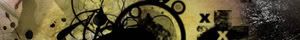
It’s meant to be a reflection of how the Arena has been the last few weeks (pretty empty). I’m pictured poking a sleeping beast trying to wake him/her for a battle. The circles are kind of random, just meant to be trippy more than anything
I originally had other ideas about how I was going to work the image. I was going to be pictured with a megaphone about to startle the bear with a strap of “bring the noise” or something – but I couldn’t find a way of doing it that I was happy with – the only way would have had me disproportionately large compared to the bear – which wouldn’t be correct in my eyes.
Last edited by littleMatt; 09-21-2006 at 10:07 AM.
-
-

haha that's funny. let's hope you suceed in poking some life into this place
-
He has risen!

bottom 2/3rds of the image is great. Funny concept yet very poinent. The type on the top left isn't very desirable, but i do like it. What really stick out is the yellow vectors. Maybe if you had blended them somehow, or tried to do a trendwhore 'glow' with some gaussian blur...maybe that would have toned them down a bit.
Nice job matt.
-
Yea I see that, I guess the one element that is throwin me off is the pen.
I (Love | Hate) Flash.
----
Save a version back so others may help you!
-
ok, ill get working on something soon nice image by the way, its quite interesting.
-
FK'n Elitist Super Mod

Title changed.
Let's get it on!
-
I like it alot! great attention to detail. The vector stuff doesent bother me but it might be just a smidge too much. I really like it though.
-
Life is too Exaggerated

i like it, not as the image really as in the images symbol...what it stands for. I think it has caught my attention more then any images this past week, good job
-
abirduphigh

Oh my, this image is full of tension, I love it.
*poke poke*
-
Senior Member
Damn my fetish for all things yellow! 
I dig what you’re all saying about the circles and text. I spent hours and hours blending the bottom half of the image – and comparatively no time at all on the sky, which shows I guess.
I look forward to your image Extricate!
I appreciate your comments and cheers for the title change E
Last edited by littleMatt; 09-22-2006 at 04:10 AM.
-
Mental Deficit

I can only postulate the probability of performing at a paramount level of perfection praised by the pulchritudinous paragon whose only practice is to preserve such a paradigm.

-
-
ok, ill try to have something up tonight or tomorrow
-
here it is

let me know what you think..
-
Chaos

there is so much going on, this post is a reserve for thoughts id like to put once i digest it all.
 Posting Permissions
- You may not post new threads
- You may not post replies
- You may not post attachments
- You may not edit your posts
-
Forum Rules
|
Click Here to Expand Forum to Full Width

|


 Reply With Quote

 The Nikon Alliance Show those 'Canon' nerds who's boss, join today!