|

-
yeah yeah yeah

Photo-Manip Critique
Hey gang, long time no type.
I've been crazy ridiculously busy with work and haven't had time to surf the internet for 4 months, much less spend any significant time on FK.
I know this is technically not the correct forum for this post and I prolly should've posted in the Art, Animation & Illustration forum, but since this is a photo-manip I wanted to put it here where it would get the most views by kindred spirits.
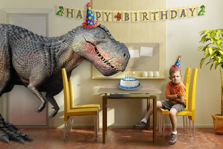
I'm putting together my son's 5th birthday invite and wanted to see what you guys thought of it.
My wife is doing the inside, but she asked me to come up with an image for the front.
Anyway, crits are most welcome, and kind of the reason why I posted to begin with. His B-Day is still a month and a week out, so I have a bit of time to take suggestions and apply them.
The card will read:
"Dinosaurs are coming alive to celebrate Owen turning 5!"

Whaddya think?
Sigs R4 Suckers! Wait... I mean.... nevermind...
-
He has risen!

that's awesome man. Perfect for what it's for. It made me smile when i saw it 
If you were going for photorealism, i'd definitely find a new picture for the cake that would be in the right angle to the table.
Otherwise, it's great man!
-
yeah yeah yeah
Thanks, Lefty!
I appreciate the comments! Man that cake is giving me fits. You know how hard it is to find a simple birthday cake on the internet that is a profile shot? Everything out there is either tilted or is some crazy shape. 
Is there anyway to modify this cake so that is in the right angle? Warp maybe?
Thanks again!
Sigs R4 Suckers! Wait... I mean.... nevermind...
-
yeah yeah yeah
tried messing with the perspective.... it's subtle. Better?
Sigs R4 Suckers! Wait... I mean.... nevermind...
-
He has risen!
any way to draw the cake rather than use a stock?
It's some pretty simple shapes with some minor textures. Might be easier than trolling through photos. But, either way, i think the jist of it is good enough without having it perfect.
EDIT: Just for an added touch, it'd be funny to see the rubber band tied to the hat go around the head of the dinosaur 
...and seeing your boy looks pretty angry, you could have air trails coming from the dino's nostrils and smoke coming up from the candles as if it'd had blown out the candles by accident.
Last edited by lefteyewilly; 07-20-2008 at 09:05 PM.
-
yeah yeah yeah
Thanks for the tip. I may give that a whirl!
And there is smoke coming from the candles. That's why he's so angry. I was trying to convey that the T Rex blew them out. I'll see what I can do to emphasize that a bit more.
Thanks!
Sigs R4 Suckers! Wait... I mean.... nevermind...
-
Nice piece sandy I agree on the cake and the idea of the rubber band lol go figure. the cae besides the perspective of it the way the shadow lays according to the light seems off causing the cake to appear to be floating some what. My thoughts. but still a spot on image.
"What do you call a mouse's Shadow in the second moon?"
-
yeah yeah yeah
Thanks for the input, D. I've got the rubber bands in, but still need to work on the cake. I agree that is is sorta floating, so I'll mess with that tonight and see if I can correct it.
Appreciate the feedback!
Sigs R4 Suckers! Wait... I mean.... nevermind...
-
supervillain

Almost anything I would have said has already been stated... the lighting on the cake is almost reversed. And it seems not be in the same perspective as the table. The dots on the hat need to be switched up a little... just for variety. Add the rubber band to the T-Rex...
-
yeah yeah yeah
Good point about the dots. Will do that. The rubber band is already in, just haven't reposted yet until I get the cake fixed. The perspective I think will still be off to some degree, cuz drawing a cake ain't working out for me too well, but I'll be fixing the floating this evening.
As to the lighting, I did it like that because of the wall behind it. It almost looks like there is a secondary light source from some windows, which you can see on the bulletin board. I set the lighting on the cake to sort of go along with that. I'll reverse it and see what it looks like.
Thanks for the crit!
Sigs R4 Suckers! Wait... I mean.... nevermind...
-
ok, so here are my thoughts. I think that the arms on the dino stand out a bit, and look too sharp (the lines that define them), as does the boys left leg. And the lighting on the chair where the boy is sittting looks too bright(at least on my screen). So my suggestion would be to blur the dino from the neck down to the arms (a little bit) and the left lleg of the boy. And maybe put a shadow from the boy. Alrighty, just a few nitpicks, but ultimately its up to you!
-
yeah yeah yeah
Thanks to all who replied!
I think I'm going with this one. I'm happy enough with it. Couldn't've done it without you guys!

Sigs R4 Suckers! Wait... I mean.... nevermind...
-
-

haha, that's great!
and in my opinion, the cake is looking better
-
Developing For Dunkets

I think its great. As far as that cake goes, instead of messing with it all I would walk on over to the local grocery store and sneak a shot of one of theirs real quick when they weren't looking! But really, looks great!
-
The cake looks much better in the latest pic. The main thing that throws me off is the lighting on the T-Rex. The main (shadow causing) light source is behind the kid, casting across the room at an angle, yet the light on the dino is coming from a combination of the opposite side and straight on (especially pronounced on its face). A little dodge and burn might help to finish it off and give it a more natural feel, but regardless of this minor point, it's a very cool pic.
Syntactic sugar causes cancer of the semicolon.
-
He has risen!
what is` it with the necro'd threads lately?
Android, there was no reason to post here. The threads been dead for quite some time.
 Posting Permissions
- You may not post new threads
- You may not post replies
- You may not post attachments
- You may not edit your posts
-
Forum Rules
|
Click Here to Expand Forum to Full Width

|


